Este artículo está disponible solo en inglés.
Most real estate agent websites are brochures that end in a form nobody fills in. We built a template that inverts it: the question the visitor came to ask is the headline, the first and only thing on screen is the field that answers it, and everything else — proof, neighborhoods, the agent's story — sits below as support rather than competing for the fold.
You can use it right now: one-question-demo.swiftagentsites.com. Nora Vance is not a real agent and Asheville is not a real market for us — it is a working sample of the template, with a real form that behaves exactly as a client's would.

This article is the spec: what the template does, the reasoning behind each decision, what the evidence actually supports, what we have not proved, and the mistake we made building it that nearly shipped the opposite of what we designed.
What is wrong with the standard agent website?
The default agent site is assembled from parts that each made sense alone. A hero photo of the agent. A paragraph about service and integrity. An MLS search widget. A testimonials carousel. A blog nobody updates. A chat bubble. A contact form at the bottom with name, email, phone, message and a consent checkbox.
Taken together they make a page with no priority. Every section is equally loud, which means none of them is. The visitor who arrived wanting one specific thing — what is my house worth, or what is actually for sale near this school — has to hunt for the place to ask, and when they find it, they are asked for a phone number before anything has been given to them.
The deeper problem is the trade. A brochure site asks the visitor to hand over contact details in exchange for a promise of future contact. That is a bad deal from their side, and most of them decline it. We have written before about MLS search specifically: it is expensive, it duplicates Zillow badly, and it rarely earns its place.
What does the research on form length actually say?
Here is where we have to be careful, because the marketing literature on this is mostly vendor blog posts citing each other. The widely repeated claims — "removing one field lifts conversion 50%", "three fields is the sweet spot" — trace back to analyses of a vendor's own customer base, which is correlation, not a test.
When you read the actual case studies, the simple story falls apart. Venture Harbour's round-up of form-length tests collects several results that point the wrong way:
- Michael Aagaard cut a form from nine fields to six and conversions fell 14%. His own conclusion: he had removed the fields visitors were most engaged with. Putting them back and rewriting the labels lifted conversions 19.21% instead.
- CXL ran a test where asking for email alone converted 13.56% worse than asking for email, name, state and driving experience.
- A MarketingExperiments test found a 15-field form beating an 11-field baseline.
- Adding a paragraph of copy above a donation form, with the form itself unchanged, cut conversions 28%.
So "fewer fields" is not the finding. The finding that survives contact with the evidence is narrower and more useful: what matters is the size and relevance of the first step, not the total number of questions. Venture Harbour's own multi-step forms carried thirty-plus questions across four steps and still converted at 53%.
That is the principle the template is built on. It does not ask less. It asks one thing at a time, and it asks for the thing the visitor already wanted to give.
The CXL result above is the strongest argument against what we built, and it deserves a straight answer rather than being left out. A form that asks for less can absolutely perform worse: fields carry signal, and a page that asks for nothing looks like it will give nothing back. Our template does not reduce what is collected — name, email and the optional property details are all still there, on steps two and three. It changes only what is in front of the visitor at the moment they decide whether to start. If that distinction turns out not to matter, the design is wrong, and the way to find out is to measure it.
How the template is built, section by section
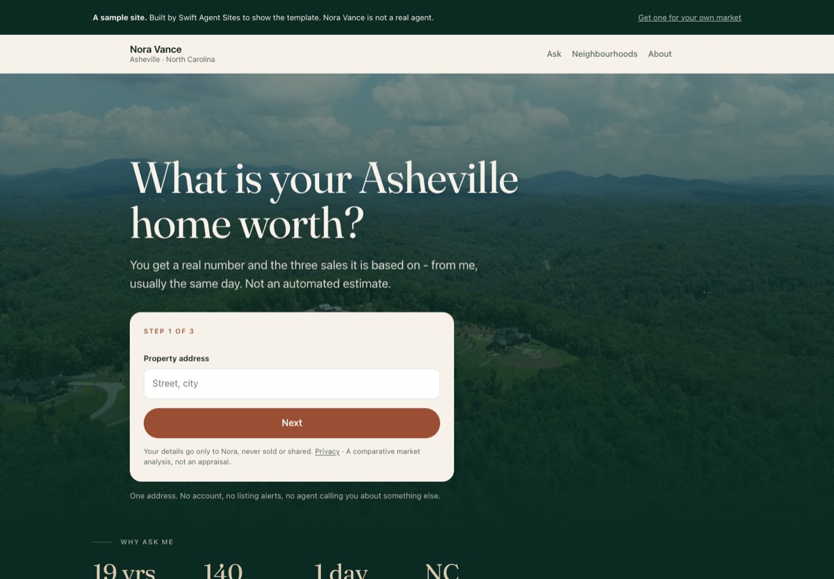
The question is the headline
Not the agent's name, not "Your trusted Asheville realtor". The page opens with the question it exists to answer, in the visitor's own words: What is your Asheville home worth? There are two questions available at the moment — home value, and what is currently for sale — and the agent picks one when the site is built. One page, one question. An agent who needs both gets two pages.
Under it sits the promise: what you get back, and from whom. On the demo it reads "You get a real number and the three sales it is based on — from me, usually the same day. Not an automated estimate." That sentence is doing specific work. It separates a human answer from the instant-valuation widgets the visitor has already met, and it sets an expectation the agent has to keep.
The first step is the address, and nothing else
Step one is a single field and a button. Not name, not email, not phone. The address is the easiest thing in the exchange to give — it is not personal, the visitor is proud of it, and typing it is the act of asking the question rather than the price of asking it.
Name and email come on step three, after the visitor has already invested two steps. Optional details — bedrooms, bathrooms, rough timing — sit on step two and are explicitly marked optional. Without JavaScript all three steps render at once and the form still works; it simply stops being the good version.
Under the card: "One address. No account, no listing alerts, no agent calling you about something else." Each clause names a real fear, because each of those things has happened to the visitor on a competitor's site.
The proof sits directly under the ask
Years in the market, homes sold, typical answer time, license. Four numbers, on the same dark panel as the question, directly beneath the form rather than halfway down the page.
The placement is the point. The visitor's objection at the moment of typing is not "is this a nice person", it is "will anything actually come back". Typical answer time: 1 day answers that, where a testimonial carousel does not. These are claims an agent must be able to stand behind, which is the intended constraint.
What happens after you ask
Three steps, in plain language: send the address, I look at it properly, you get the number and the reasoning. The third includes the line we argued hardest for: "If the honest answer is 'not yet', you get that instead."
Agents resist this one, because it concedes that the answer might be unwelcome. It is the most persuasive sentence on the page for exactly that reason — it is the first thing a visitor has read that was not written to get them to convert.
Neighborhoods, then who you are asking
Area cards link to the agent's own area guides. These are the AEO surface: the pages that answer "what is it like to live in Montford" are the ones a language model can quote. We have written separately about why that matters more each year.
Only then does the agent appear, under the heading Who you are asking — framing the bio as an answer to a question the visitor has now actually formed, rather than an introduction they never requested.
Ask again
The page ends by repeating the same question and the same form on a dark panel. A visitor who read to the bottom has been persuaded and should not have to scroll back up.
What the template deliberately leaves out
- MLS or IDX search. It competes with the one question, and it loses to Zillow on its own terms.
- A blog on this template. Area guides stay; a general blog does not. It adds navigation without adding an answer.
- A testimonials carousel. Replaced by four verifiable numbers.
- A chat widget. It asks the visitor to start a conversation, which is a larger commitment than typing an address, while pretending to be smaller.
- The stock bio. "Passionate about helping families find their dream home" is on ten thousand agent sites and conveys nothing.
Every omission is a fight with the agent's instinct to include everything. The template's position is that a page that answers one question well beats a page that gestures at twelve.
The mistake we made building it
The first version shipped without the script that drives the multi-step form. The code for one-question-at-a-time was already written and already tested — it simply was not switched on for this template. Every field rendered at once: address, name, email, phone, consent, stacked down the fold.
We had built, and published, a wall of a form on the template whose entire argument is that a wall of a form is the problem. One missing line.
Worse was the test. We had written a check that the step script was present, and it passed while the bug was live, because it searched the page for the string js-steps — which also appears in a CSS rule. The test was matching a stylesheet and reporting the feature as working. It now counts the actual form steps and checks that the address field comes before the email field.
We are including this partly because it is the honest record and partly because it is the useful part: a test that cannot fail is worse than no test, because it buys confidence it has not earned.
What we have not proved
We have not A/B tested this template against our standard one. It is live, it is a design argument backed by the published evidence on multi-step forms, and it is not yet a measured result. We would rather say so than quote someone else's conversion lift as if it were ours.
The claim we can make is narrower: the first step asks for one low-cost piece of information that the visitor wants to give, which is the pattern the better-documented tests support. When we have enough traffic through it to say something real about completion rates, we will publish the numbers the same way we published the bounce rates on guessed email addresses — including if they disappoint us.
Who should not use this template
- An agent whose site must be a brokerage brochure. If the site's job is credibility for a referral network rather than inbound questions, a conventional layout does that job.
- Listing-led luxury. Where the inventory is the draw and each property is a campaign, the listings should lead.
- Anyone who will not answer. The template promises a human reply, usually within a day. An agent who cannot keep that promise should not make it — the page is a liability rather than an asset, and a visitor who is ignored tells people.
Common questions
Does the one-question page hurt SEO by having less content?
The question page is short on purpose. The depth lives in the area guides it links to, which is where search and answer engines find material worth quoting anyway. A long page of generic "why choose me" copy ranks for nothing.
What happens to the leads?
They arrive by email immediately and land in the agent's lead inbox. The visitor gets an automatic acknowledgment. Nothing is sold or shared, which the form says in plain words next to the button.
Can I change the question the page asks?
Two are available now — home value, and what is currently for sale — chosen when the site is built, along with the promise line underneath. More can be added; the constraint is one question per page, not one question forever.
Does the form work without JavaScript?
Yes. All three steps render at once and the form submits normally. It degrades to an ordinary form rather than to a broken one.
Is the home value a real valuation?
No, and the page says so under the field: it is a comparative market analysis from the agent, not an appraisal. Agents who blur that line create problems for themselves.
How long does it take to get one?
We build a free preview with your name, your market and your numbers on it before you pay anything, usually within a day or two of asking.
See it, or get one
The sample site is live at one-question-demo.swiftagentsites.com — submit the form if you like, it behaves exactly as a client's does.
If you want this for your own market: swiftagentsites.com/free-preview.
Related reading
- What should a real estate agent website include?
- Why adding MLS listings to your website usually isn't worth it
- What is AEO, and why real estate agents should care
- How new real estate agents get their first leads online
- Guessed email addresses bounce at 16%
- How much does a real estate agent website cost?
Sources
- Venture Harbour — How form length impacts conversion rates (collects the Aagaard, MarketingExperiments and multi-step results cited above)
- CXL — Should you really reduce form fields? (the Aagaard case, and CXL's own email-only test)
- Venture Harbour — Increasing leads by adding "good" friction
- Cobloom — Form fields and conversion rates: is less really more?
- Live template: one-question-demo.swiftagentsites.com